- Industry
- Home & Living
- Year
- 2025
- Role
- Design and build
- Built with
- Shopify Theme DevelopmentLiquidMadrid Theme
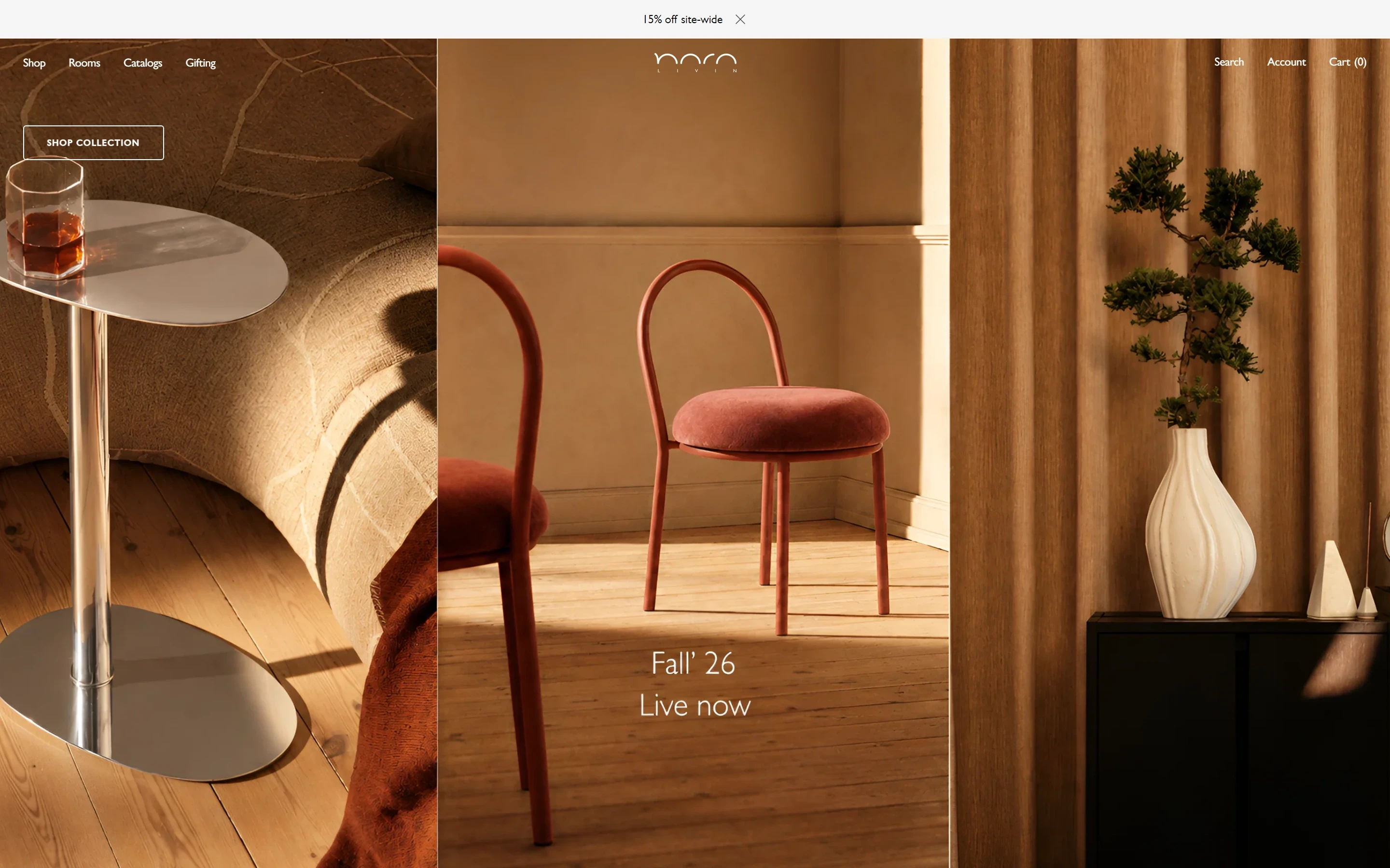
Nara Livin makes home goods at the editorial end of the market. Their lamps have architectural silhouettes. Their tables have been featured in Elle Decor and Design Pataki. The brief arrived as a complete Figma design system with one instruction: match it exactly.
Nara Livin, in numbers.
The brief
Madrid doesn’t give you Gill Sans at nine sizes, a seasonal gifting template, or a custom lightbox for material swatches. Every spacing value, every overlay percentage, every border radius was specified in the Figma file. Approximately correct was not an option. The store launched to its first paying customers within six weeks of brief sign-off.
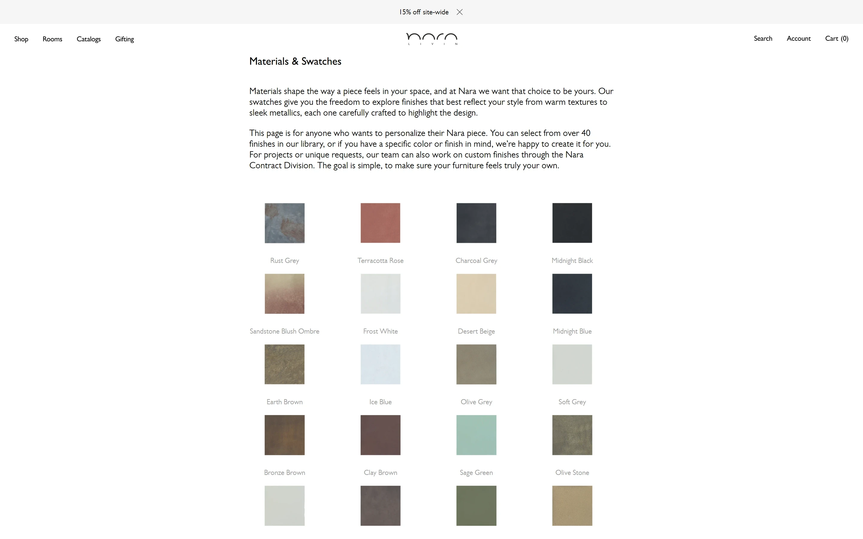
Madrid was the base. Nearly every front-end detail was replaced. Gill Sans is not a Google Font, so font loading was handled explicitly to ensure 9px labels render identically on Mac and Windows. A custom lightbox was written in Liquid for the swatches page. The gifting page got its own editorial Liquid template. The material swatches grid was built on Shopify metaobjects.
The store launched in 2025. After sign-off, the client reviewed the live site against the Figma file section by section. There were no revision requests on the design.
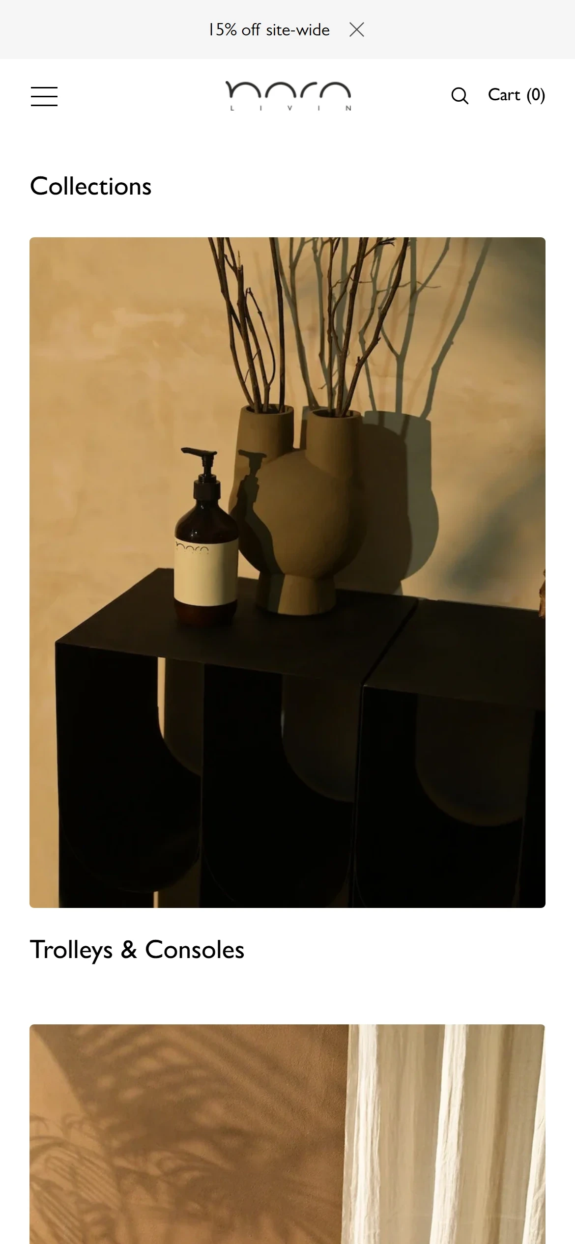
Three pages, on a phone.
The swatch lightbox
Each finish on Materials & Swatches opens large in a lightbox written in Liquid, with its name under it, and closes back to the grid.
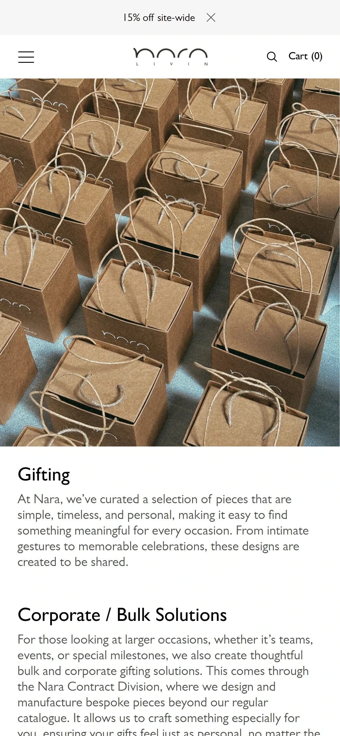
The gifting page
Its own template: a full-width photograph of the gift cartons, then Gifting and Corporate / Bulk Solutions, then Nara’s Gifting Picks.
The editorial home
The Fall 26 slideshow, a product slider, Top Picks and a grid, each laid out on the brand’s own photography.
Screens
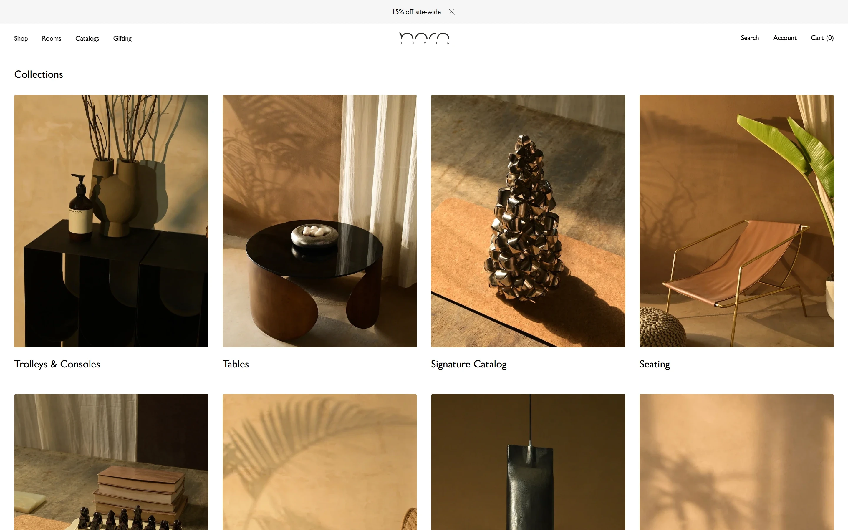
Collections, in photographs
Collections opens on a grid of large photographs, each named under it: Trolleys & Consoles, Tables, Signature Catalog and Seating.
The product page
The gallery on the left; on the right the name, the material, Add to cart and Buy it now, then delivery, returns, customisation and sourcing, each one line.
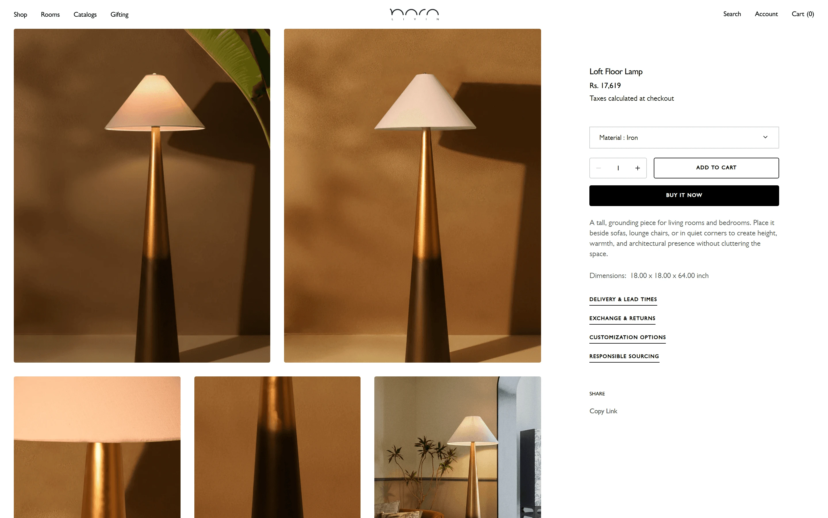
Product page at launch
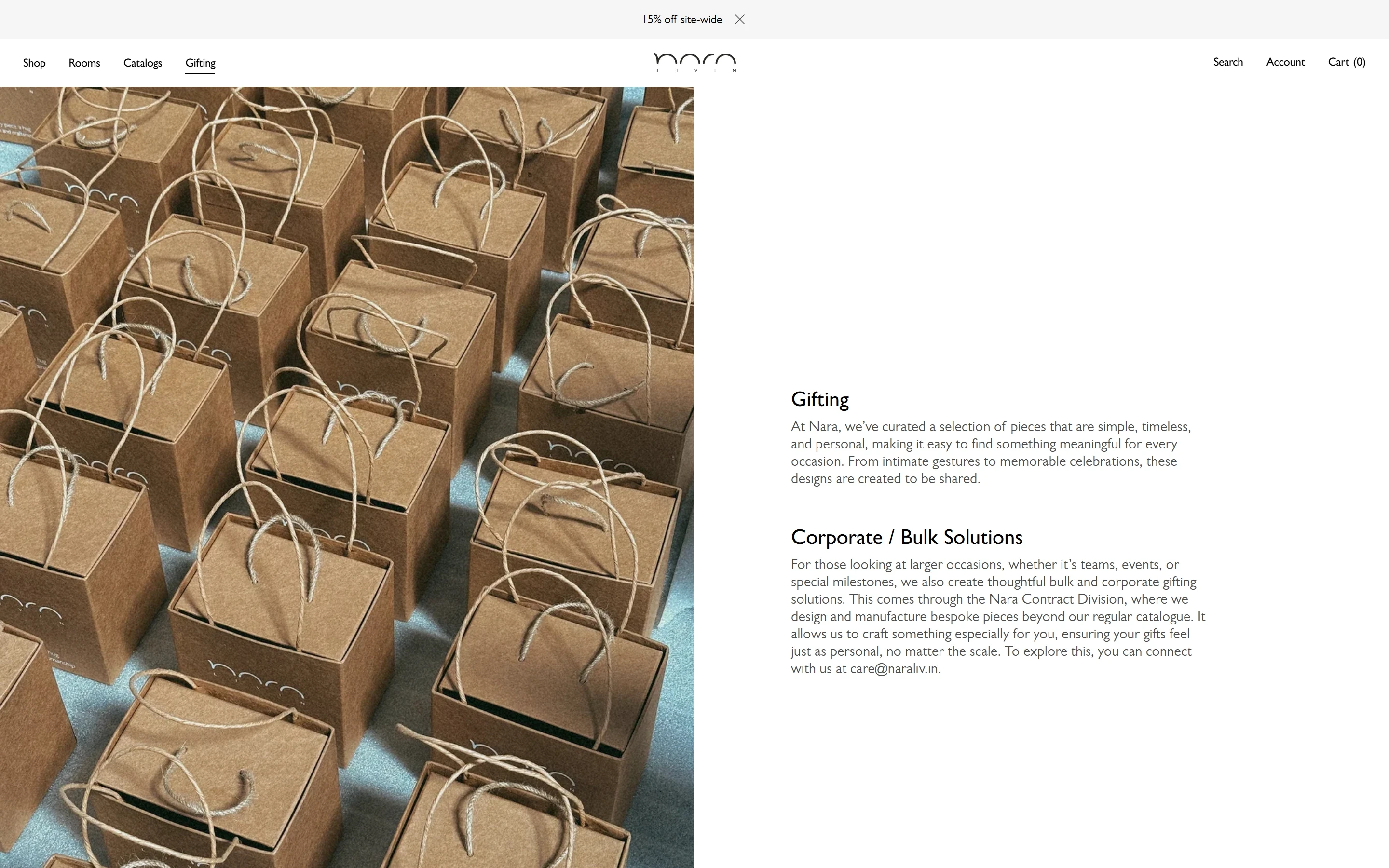
Gifting, on its own template
The gift cartons fill the left half; the right holds the Gifting and Corporate / Bulk Solutions copy.
Materials & Swatches
An introduction, then the finishes as a grid of squares, each with its name. A tap on one opens it in the lightbox.
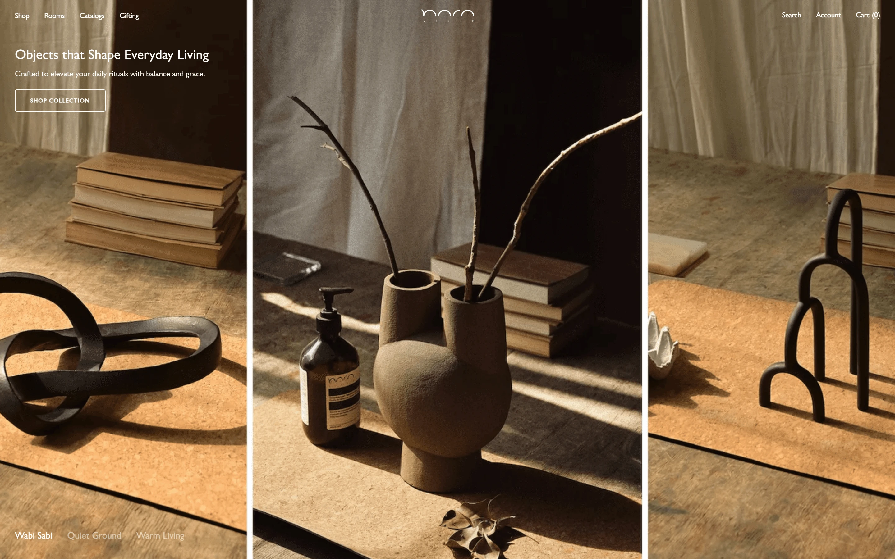
Homepage at launch
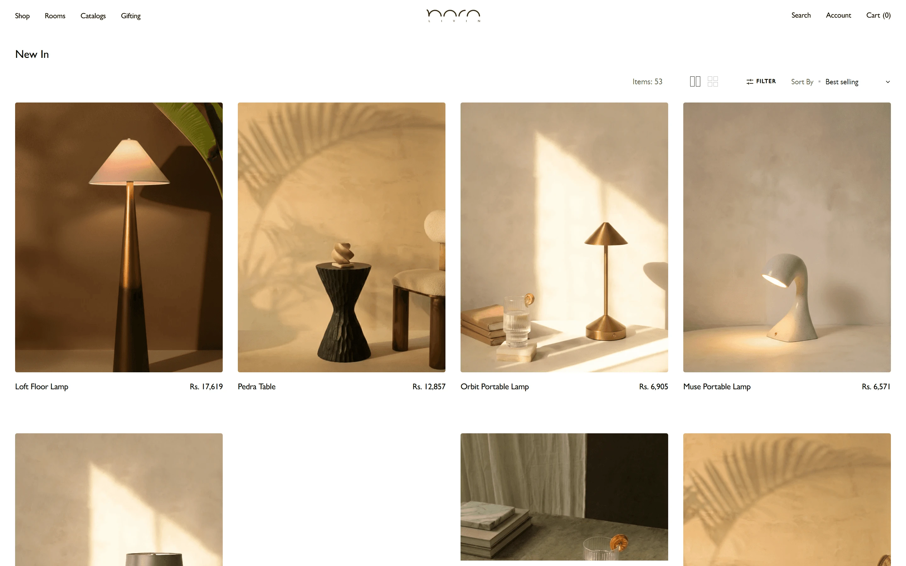
New In
A collection page: four large cards to a row, the name and price under each.
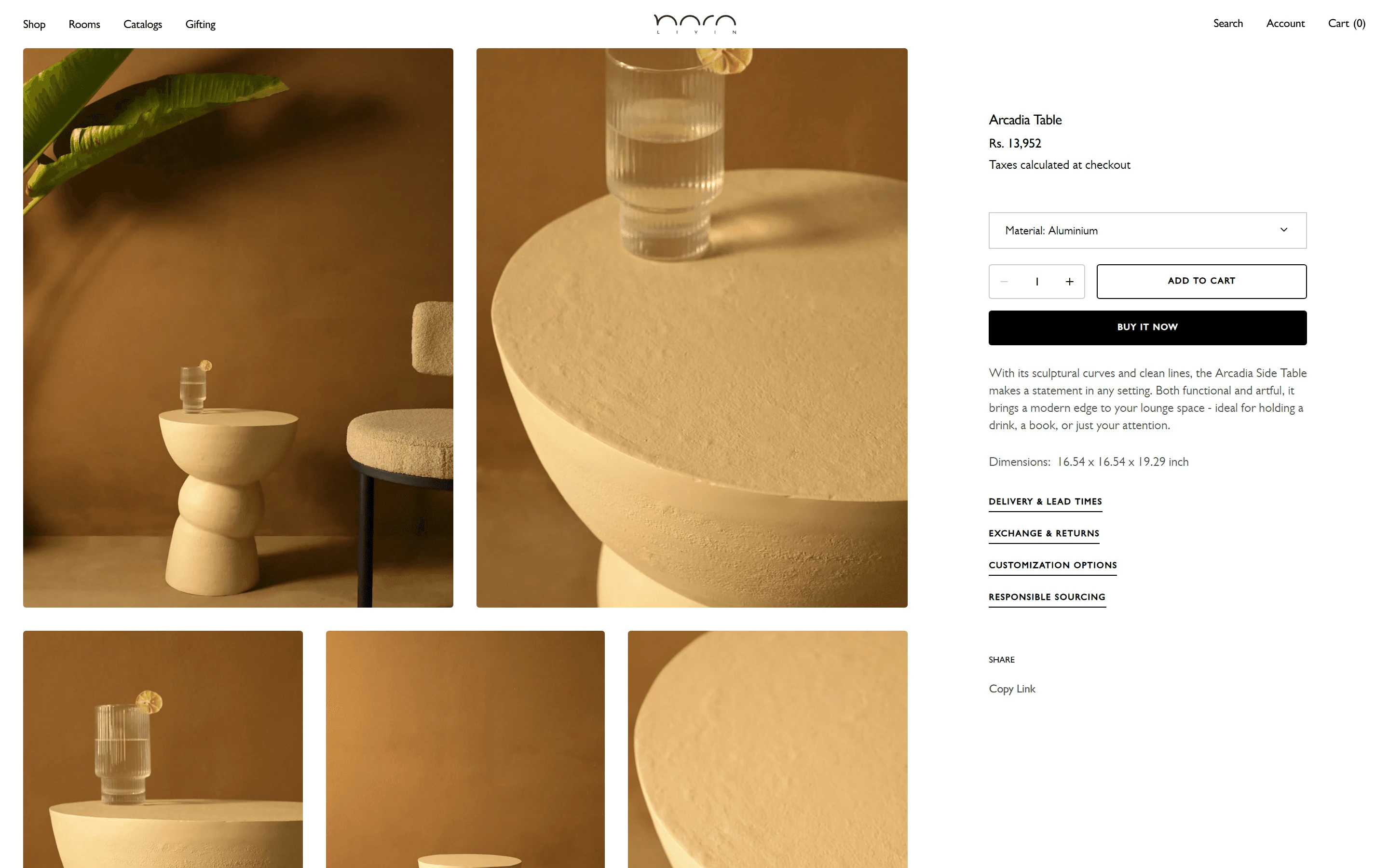
A table’s page
The Arcadia Table, with the same layout as the lamp: gallery left, buying right.
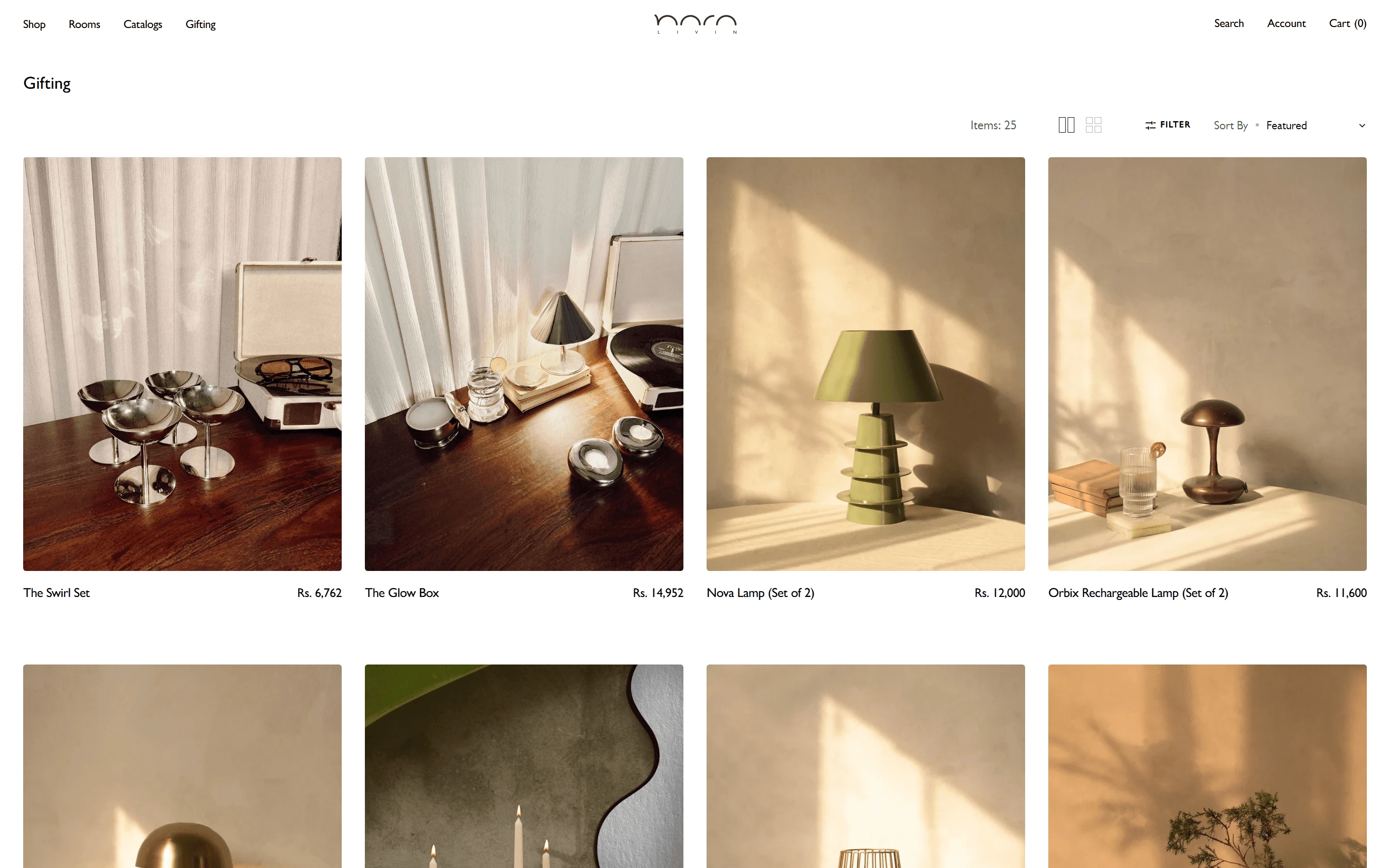
The gifting collection
The Swirl Set, The Glow Box and the lamps sold in pairs.
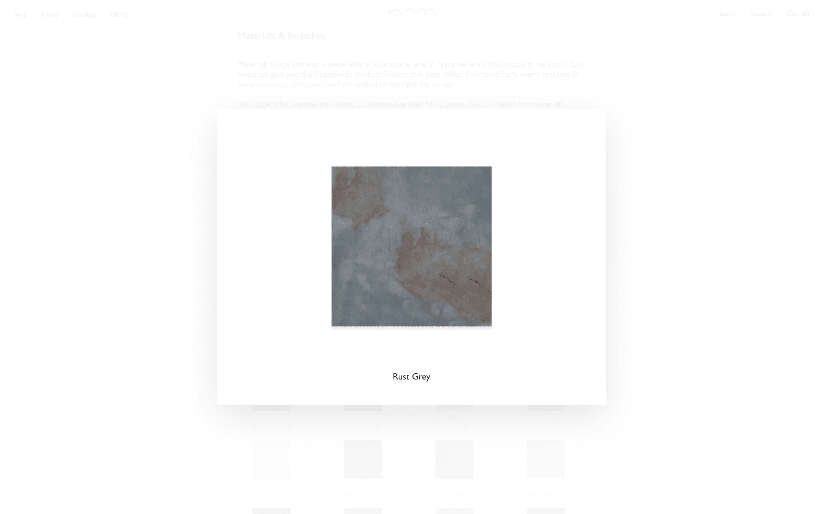
The lightbox on a laptop
Rust Grey open over the faded swatches page.
The plan.
The site’s architecture
The homepage over its collections, the product template, cart and checkout; under them the two custom Liquid pages, gifting and material swatches, and the builds behind the swatches.
The design brief
The brand’s four words, the Gill Sans type scale down to its 9px labels, the constraints taken from the Figma file, and the custom builds.